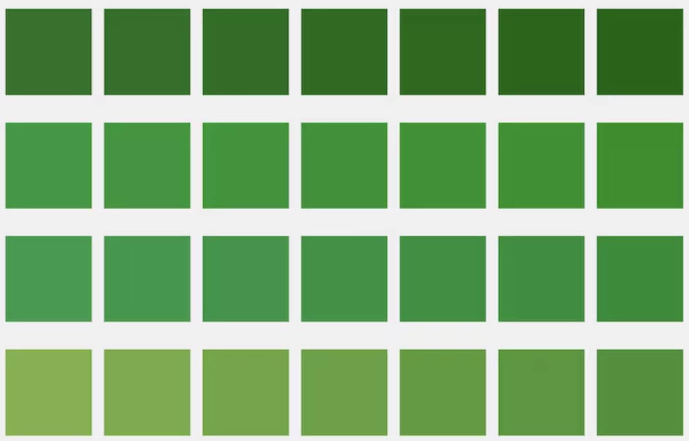
Why Shades of Green?
Green is a versatile color that evokes growth, balance, and calm. From lush forest greens to crisp mint shades, green reads as natural, modern, and reassuring. For designers and creators, it offers a unique range of tones that can work for branding, UI, illustration, packaging, and motion design. Choosing the right shade of green — and pairing it thoughtfully — can shift a project’s tone from playful to premium, or from trustworthy to cutting-edge.
How to Think About Green Palettes
- Context matters: For eco brands, deeper forest greens communicate authenticity; for fintech or SaaS, muted greens signal stability.
- Contrast and accessibility: Combine greens with neutrals and accent colors to ensure legibility and sufficient contrast for users with visual impairments.
- Temperature and mood: Warm greens (yellow-leaning) feel energetic; cool greens (blue-leaning) feel calm and tech-forward.
- Material and finish: In product design, glossy vs matte finishes interact differently with green. For digital, gradients and subtle shadows add depth.
Pairing Greens with Neutral Systems
A green-first palette shines when balanced with a neutral system. Consider a three-layer neutral scale: surface, text, and muted. These layers provide consistency across UI components and keep the green tones from overpowering the design.
Surface
Cards, sheets, and panels
Text
Primary copy, headings
Muted
Supportive copy and metadata
Accent Colors & Contrast
Pair greens with complementary accents to introduce hierarchy and motion. Warm golds, deep indigos, and soft corals work exceptionally well. Below are a few ready-to-use accents and where to apply them.
- #FFD166
Warm Accent — use for highlights and important microcopy.
- #4056A1
Indigo — great for links and secondary CTAs.
- #FF8A80
Soft Coral — friendly notifications and warnings.

Micro-interactions & Motion
Motion and micro-interactions give green palettes life. Subtle hover lifts, green glow shadows, and short easing curves help communicate interactivity while keeping attention on content. Pro tip: use slightly lighter greens for hover backgrounds and a faint glow of the primary green for focus states to maintain accessibility.
Button Interaction
Focus & Accessibility
Add a 3-4px outline or ring using a contrasting tint: ring-4 ring-[#C7EFCF]. Ensure focus is visible without relying solely on color.