Introduction to CSS Flexbox
In modern web design, CSS Flexbox has become one of the most powerful layout modules for building responsive and flexible designs. Unlike traditional methods such as floats or tables, flexbox simplifies the alignment and distribution of elements inside a container. Whether you are just starting out in front-end development or an experienced developer, understanding flexbox css will completely change the way you build layouts.

What is Flexbox?
The term flexbox stands for flexible box. It is a CSS3 layout mode designed to arrange elements in a predictable way, even when screen sizes or content dimensions are unknown. The main goal of css flexbox is to provide space distribution between items in a container and offer powerful alignment capabilities.
For example, if you want to center a div horizontally and vertically, flexbox css allows you to do it with just a couple of lines instead of writing complex CSS rules.
Why Use CSS Flexbox?
- Simplifies layout creation compared to floats and positioning.
- Supports responsive designs without media query overload.
- Allows vertical and horizontal alignment with ease.
- Dynamic resizing of child elements to fit available space.
Basic Flexbox Syntax
.container {
  display: flex; /* Enables flexbox */
  justify-content: center; /* Horizontal alignment */
  align-items: center; /* Vertical alignment */
}
Key CSS Flexbox Properties
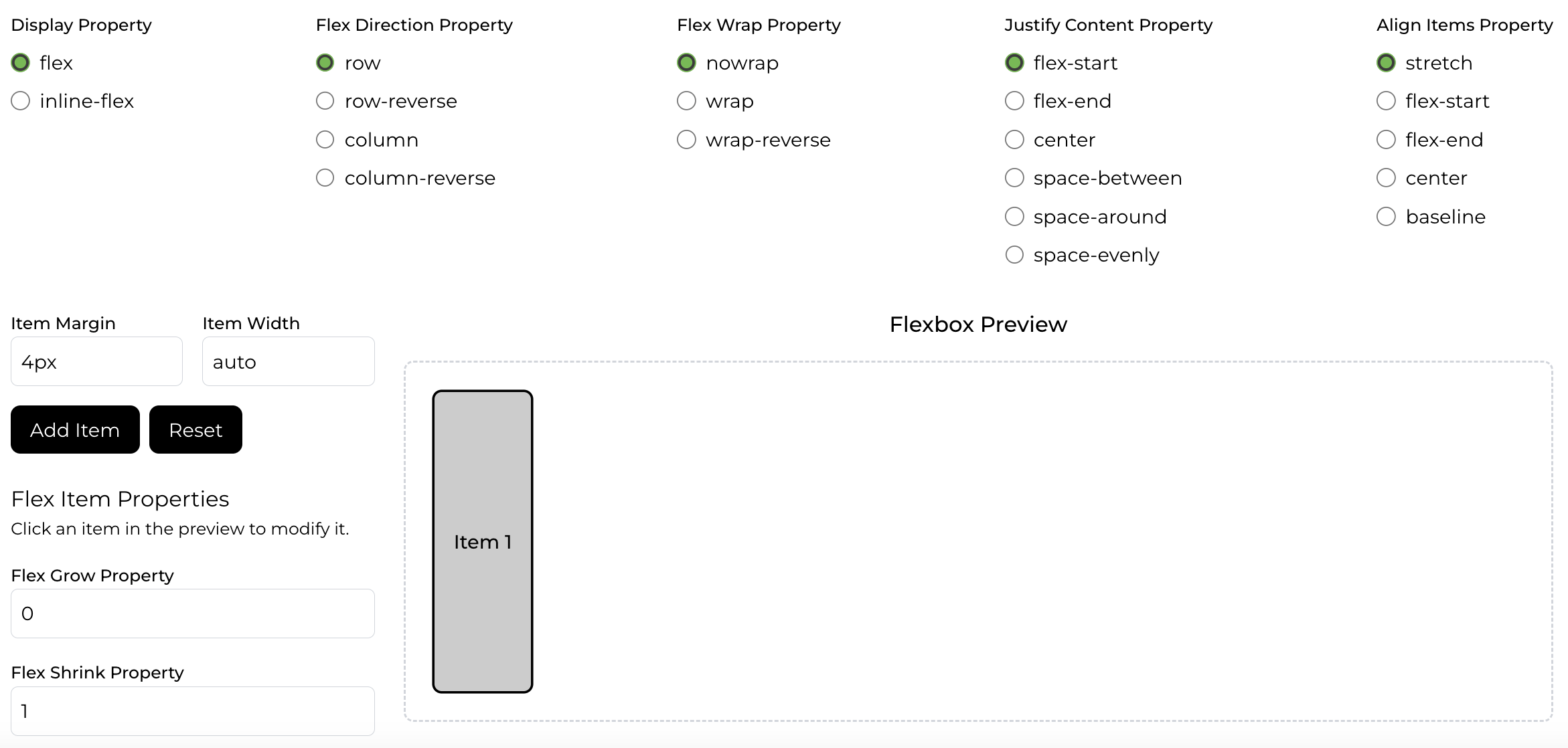
flex-direction– Defines the direction of items (row, row-reverse, column, column-reverse).justify-content– Controls horizontal alignment of flex items.align-items– Controls vertical alignment of flex items.flex-wrap– Allows items to wrap into multiple lines.align-content– Aligns multiple lines of flex items.
1. flex-direction – Deciding the Main Axis
The flex-direction property defines how items are placed inside a flex container by deciding the main axis. By default, the main axis runs horizontally, but you can change it depending on your layout needs:
- row: Items are positioned left to right. Common for navigation menus or toolbars.
- row-reverse: Items flow right to left without changing the HTML order.
- column: Items stack top to bottom, forming a vertical list.
- column-reverse: Items appear bottom to top, often used in chat UIs.
Tip: The DOM order remains the same even if you use *-reverse, so screen readers still follow the original order.
2. justify-content – Aligning Along the Main Axis
This property manages alignment along the main axis. In rows it’s horizontal, in columns it’s vertical. It controls how space is distributed between items:
- flex-start: Packs items toward the start of the container.
- flex-end: Packs items toward the end.
- center: Centers items along the axis.
- space-between: Equal gaps between items, none at the edges.
- space-around: Equal space around items, including edges.
- space-evenly: Equal spacing everywhere, edges included.
Use case: Ideal for toolbars, navigation links, or evenly spacing cards in a row.
3. align-items – Aligning Along the Cross Axis
While justify-content aligns along the main axis, align-items works on the cross axis (perpendicular). It controls vertical alignment in a row or horizontal alignment in a column:
- flex-start: Aligns items to the top (row) or left (column).
- flex-end: Aligns items to the bottom (row) or right (column).
- center: Centers items along the cross axis.
- baseline: Aligns text baselines — great for mixed-size text.
- stretch: Items grow to fill the cross axis if not sized.
Tip: Use align-self for item-level alignment overrides.
4. flex-wrap – Controlling Line Breaking
By default, flex items stay on one line. The flex-wrap property allows wrapping onto multiple lines when needed:
- nowrap: Default. All items remain on one line.
- wrap: Items wrap to a new line when space runs out.
- wrap-reverse: Like wrap, but new lines stack above/left of prior lines.
Use case: Great for responsive card grids that adjust with screen width.
5. align-content – Spacing Between Multiple Lines
When wrapping creates multiple lines, align-content determines how those lines are spaced on the cross axis:
- flex-start: Packs lines toward the start.
- flex-end: Packs lines toward the end.
- center: Centers lines in the container.
- space-between: Even gaps between lines.
- space-around: Equal space around each line.
- space-evenly: Uniform spacing everywhere.
- stretch: Lines stretch to fill space.
Important: Works only when there are multiple lines (e.g., with flex-wrap: wrap).
CSS Flexbox Examples
Here’s how you can create a simple responsive navigation bar:
.navbar {
  display: flex;
  justify-content: space-between;
  align-items: center;
}
Responsive Design with Flexbox
One of the most powerful uses of css flexbox is in building responsive layouts without needing too many media queries. Elements inside a flexbox container can shrink or grow based on available space, making them naturally responsive. This is particularly helpful when building mobile-first designs.
Flexbox vs Grid
Developers often compare flexbox css with CSS Grid. While flexbox is excellent for one-dimensional layouts (rows or columns), Grid is better for two-dimensional layouts (rows and columns together). Many modern layouts actually use a combination of both css flexboxand Grid.
Advanced Flexbox Techniques
Once you master the basics of flexbox css, you can start exploring advanced patterns such as equal-height cards, sticky footers, and fully centered hero sections.
Common Pitfalls and How to Avoid Them
- Overusing
flex: 1;without understanding growth and shrink rules. - Forgetting that
align-itemsaffects the cross-axis, not the main axis. - Mixing flexbox with float-based layouts, causing conflicts.
Real-World Use Cases
- Building navigation bars
- Designing responsive cards
- Creating equal-height columns
- Centering modals and popups
- Designing dynamic forms
Conclusion
The css flexbox model is an essential tool for every modern web developer. By mastering flexbox css, you can design layouts that are flexible, responsive, and easy to maintain. From simple alignment tasks to complex UI components, flexbox gives you the power to build professional web designs faster and with cleaner code.
As you continue practicing, try combining css flexbox with CSS Grid and Tailwind CSS utilities. This combination will allow you to create elegant, responsive, and scalable designs for real-world projects.